Among the reasons why printed books have survived in the age of digital media, the appeal of a well-designed cover must rank high on the list. This summer, SVA Features is presenting notable recent titles whose covers were created by School of Visual Arts alumni, with comments from the designers and the books' authors. Some originally appeared in the article "Color Commentary: Book Cover Design," in the spring 2016 Visual Arts Journal; others are online exclusives.
This week's entry: Witches of America (Sara Crichton Books, 2015) by Alex Mar, named a Notable Book of 2015 by The New York Times Book Review. Rachel Willey (BFA 2012 Graphic Design) designed the cover. Willey is a freelancer and an in-house designer at Penguin Random House.
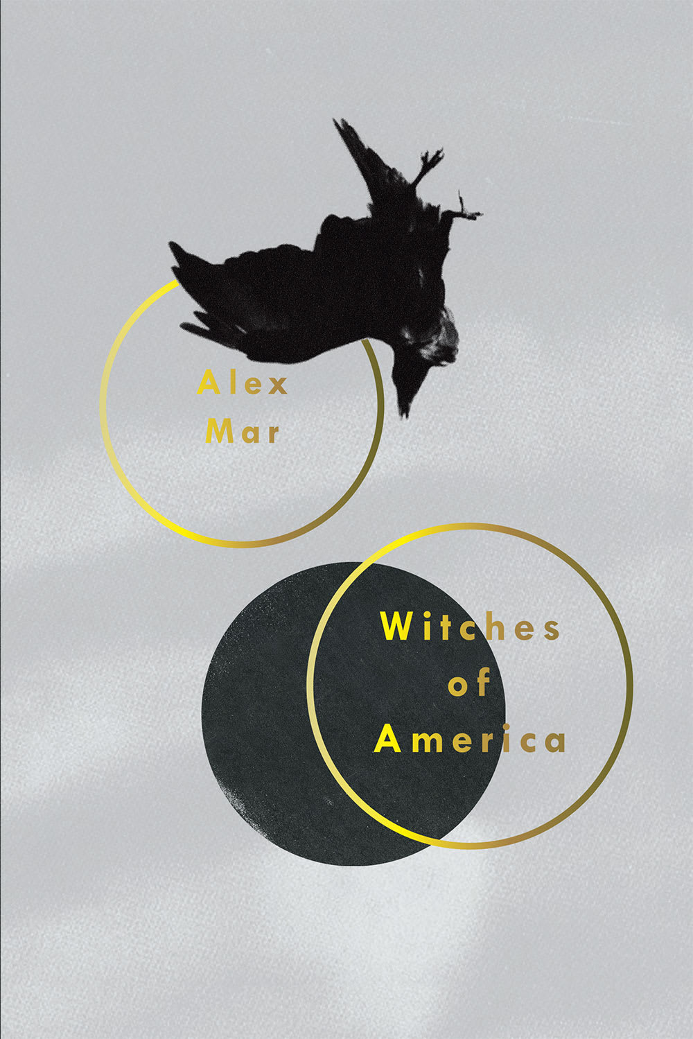
Witches of America
Nonfiction Profiles of contemporary American practitioners of witchcraft
Author Alex Mar
Designer Rachel Willey
Willey: I missed the mark on my first couple of rounds for this. My kneejerk reaction was to include “typical” witchcraft imagery—pentagrams, etcetera—but that was too on-the-nose. Crows and ravens play a big part in the Wiccan religion, but I thought they were ambiguous enough image that the association wouldn’t be immediate.
This particular photo was taken by a photographer named Norman Rich. I can’t remember how exactly I came across it. It has been heavily edited. The original is in color, on a blue sky, and has two crows that look like they are diving towards each other. I took out one of the crows and replaced it with a graphic element, the circle, to make the composition unusual. I did have moons in mind when choosing the circle, as they’re another important Wiccan symbol, but I didn’t want to be too literal. I kept the type treatment simple and bold. I wanted the cover to be as clean and iconic as possible.
Mar: I wanted a cover that avoided any clichés, and that conveyed that this is a book that deals with witchcraft in the present day, and in a fresh way. When I went in to look at the options they showed me two, both by Rachel. This one was my favorite, but just to be sure I took a walk around the block and then came back and looked at them again.
Everyone I’ve spoken to is mesmerized by the cover. The font is super-clean and neutral and contemporary, but the gold circles remind me of the striking simplicity of centuries-old occult symbols. And there’s the raven, which is a recurring motif in the book, but it’s in this strange, rotated position. It really grabs people.
Next week: John Irving's In One Person (Simon & Schuster, 2012).