The disparate worlds of art and sports don’t traditionally intersect that often. Yet graphic designer, professional sports branding expert and writer Todd Radom (BFA 1986 Media Arts) has combined his loves of art and our national pastime, baseball, since he was a teenager. In 1979, at the tender age of 15, a series of his baseball ephemera-themed illustrations were publicly exhibited and this intersection of art and sports would become the cornerstone of his career.
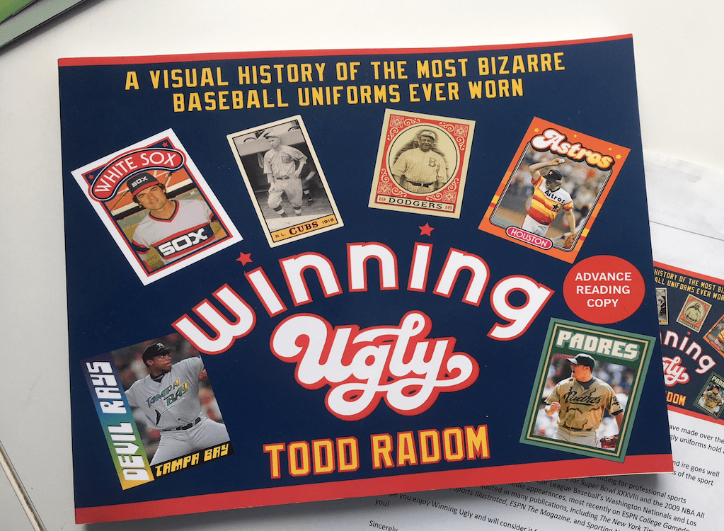
Described as an “ode to those eyesores,” Radom's latest book, Winning Ugly: A Visual History of the Most Bizarre Baseball Uniforms Ever Worn, (Sports Publishing) is an affectionate tribute to some of the worst designs in baseball sports uniform history.
And while there are many ill-conceived blunders and aesthetic unforced errors to warrant a hearty Bronx cheer, Radom also provides a fascinating context to the designs. Winning Ugly captures a period before companies cautiously focus-grouped creative ideas to death. For all the visual monstrosities inside, Radom keenly pinpoints not only the Wild West qualities of the anything-goes designs, but an audacity often so bold, you have to admire its chutzpah.
Crucially, Radom’s book isn’t ironic and the affection for the sport and garish designs shine through like the warmth one has for ugly Christmas sweaters.
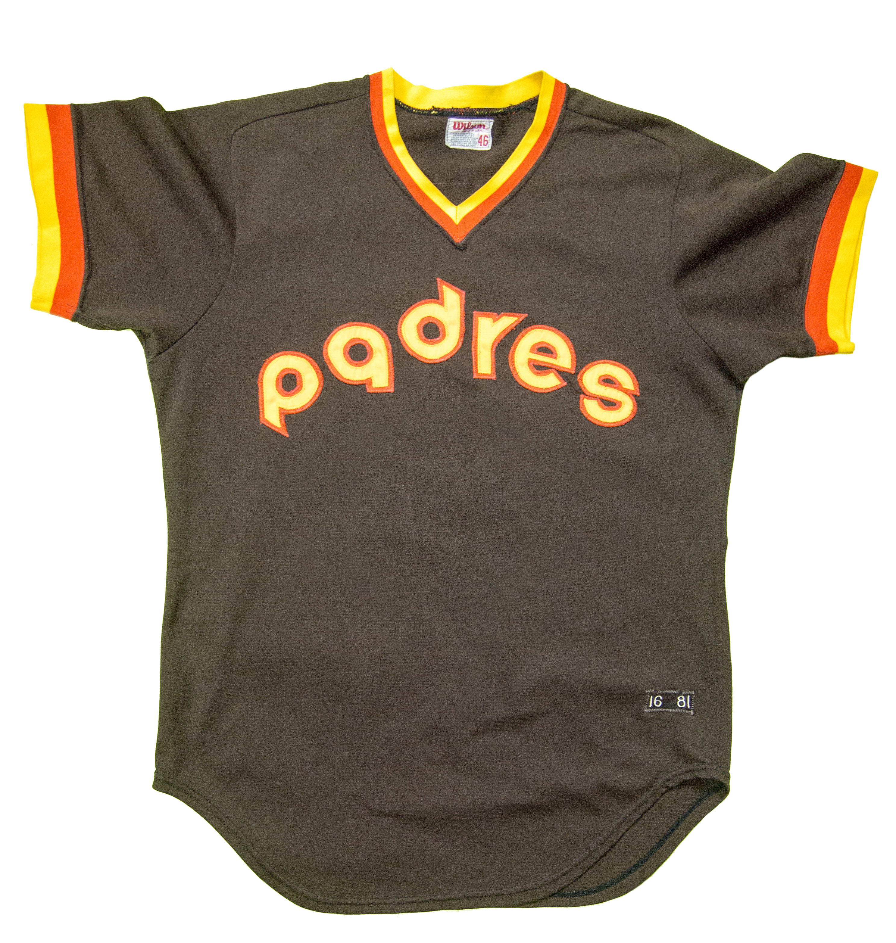
The 1981 San Diego Padres uniform.
In addition to his sports branding work, Radom continues to work on a range of projects, from poster and book jacket design to apparel design and corporate identity. His work includes the official logos for Super Bowl XXXVIII, the 2009 NBA All Star Game, the graphic identities of multiple Major League Baseball teams, and league and team identity and branding for the Big 3 basketball league. He has provided commentary about sports logos and branding for ESPN College Gameday, National Public Radio, and The New York Times and has been profiled or quoted in publications including The Washington Post, Chicago Tribune, Sports Illustrated, ESPN The Magazine, and Sporting News.
Radom’s loving chronicle and collection of some of baseball’s hardest, most gaudy swings-and-misses is a must-read and will delight both longtime sports fans and aficionados of awesome/terrible design. Here’s our conversation with Todd now that Winning Ugly is available on book shelves and digital stores everywhere.
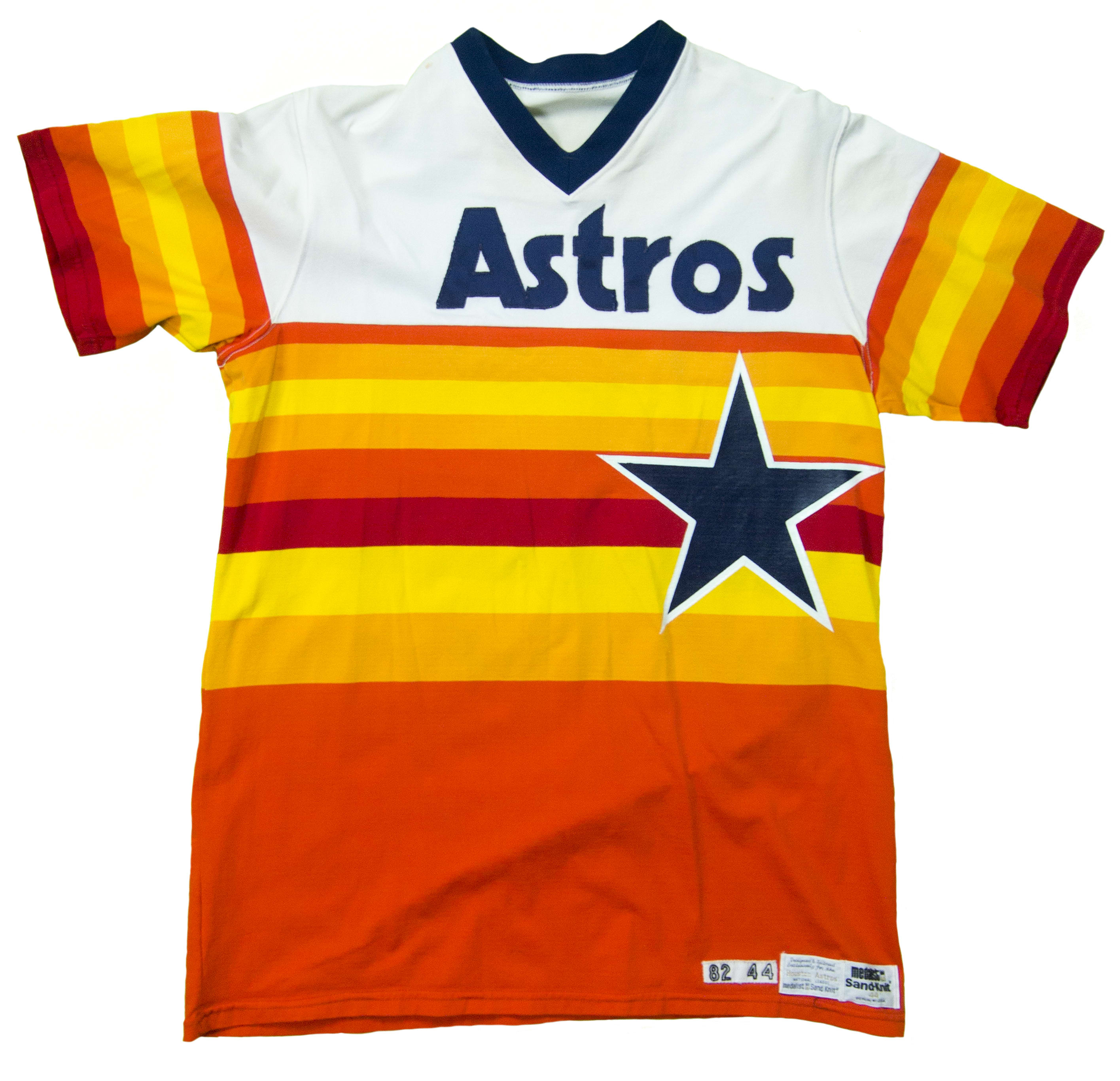
The 1982 Houston Astros jersey.
What inspired the book?
The New York Times came to me last April to write an opinion piece on the joys of ugly baseball uniforms. That served as the springboard to the book.
You’re a big baseball enthusiast, then?
I am a fan, absolutely—have been since I was a kid. Moreover, I’ve been observing the visual culture of professional sports, particularly baseball, since I was really young. Baseball, as I say in the book, is a sport that lends itself to introspection and observation. There was such a deep well of history to tap into here.
The book is an “ode to the eyesores,” so presumably you have affection for even poor design.
I do in fact. These sometimes unplanned disasters — “dumpster fires,” as I call them in some cases—are often wonderful for their lack of sophistication and lack of adherence to focus groups and the like. This stuff is very moderated now, but the fact is, that before the early, 1980s teams and leagues had little or no brand standards and had license to experiment in ways that are unthinkable today.
What kind of research did you do?
One of the many hats I wear around here is “researcher.” I’ve been researching and digitizing the historical marks for Major League Baseball since 1993, and the stories behind the art have always intrigued me. As far as the book goes, I went down many rabbit holes in search of facts, anecdotes, and perspective. I dug really deep into the archives of The Cincinnati Enquirer, for instance, in finding out more about the origins of the what we now know as the baseball uniform, from back in the late 1870s. I found great items about how this stuff was scrutinized from the earliest days of the professional game, including an 1882 article in which The Detroit Free Press calls the National League’s varied-colored uniforms “clown suits."
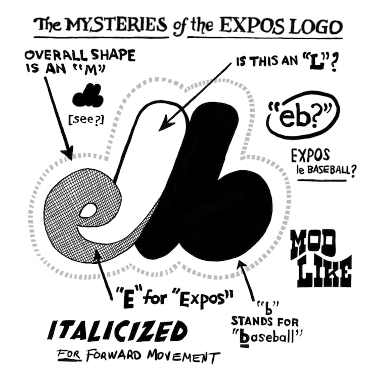
The Montreal Expos logo explained by Todd Radom.
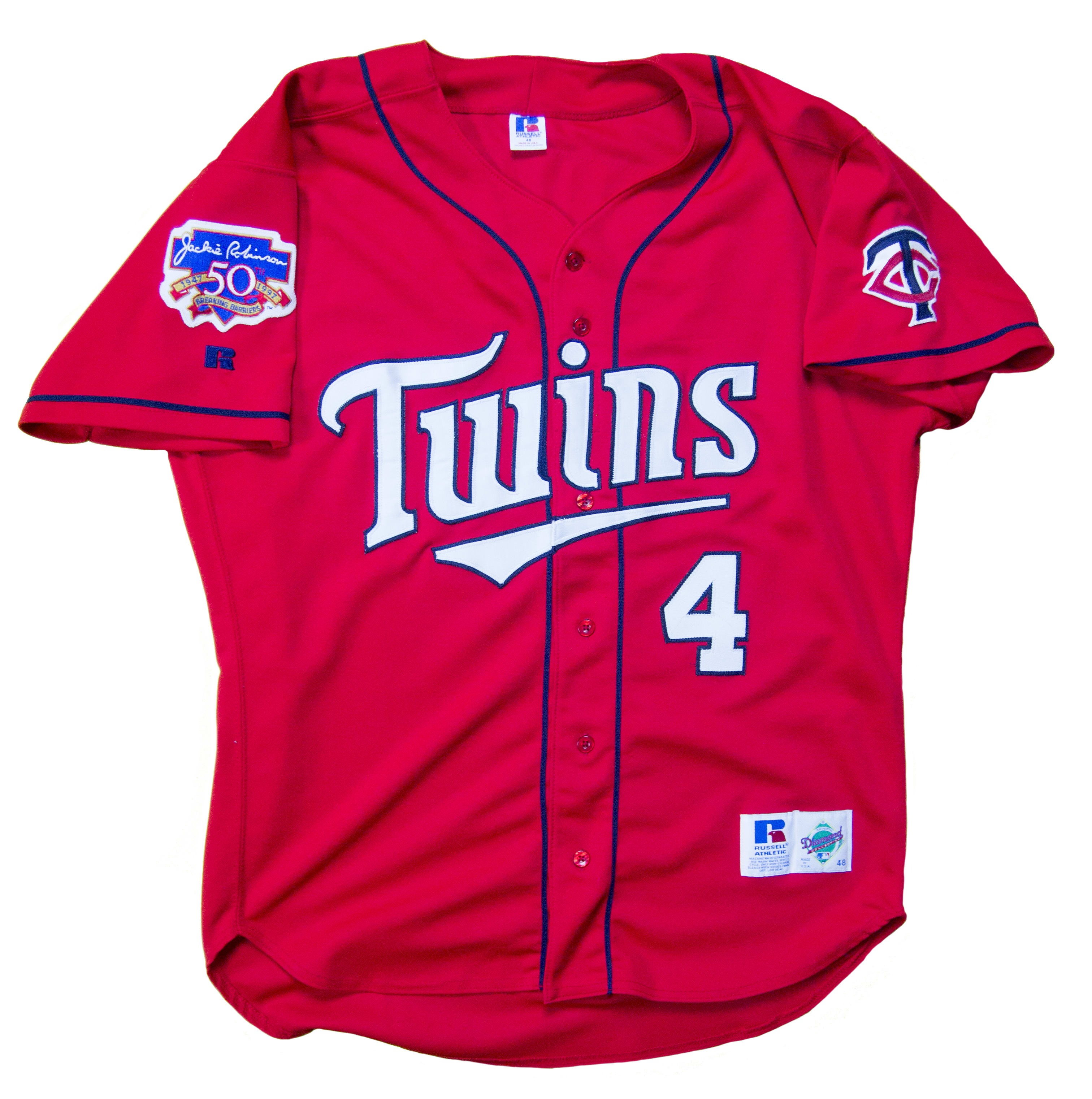
A 1997 Minnesota Twins uniform.
What was your favorite discovery in the book?
There are several great finds, but my favorite revolves around the Chicago White Sox of the early 20th century. The team was known for their navy blue road uniforms, a real signature thing for them—suddenly, in 1916, they went to gray on the road. The reason? World War I was raging in Europe, and that’s where blue dyes were imported from. Manufacturers couldn’t get their hands on blue dye, so the White Sox had to go gray.
What’s the best/worst sports outfit in your mind?
Gotta go with the Houston Astros’ famous rainbow/“tequila sunrise” look. It’s incredibly garish, but it’s also audacious and a product of its time, the mid-70s in Houston, where man defied the elements and built the first indoor stadium, heat and humidity be damned. Three decades after it was last worn on a regular basis it continues to resonate with fans.
What’s the genuinely worst one? No qualifiers this time.
We tend to think of the distant past in black and white, so imagining some of the disasters of the 19th century intrigues me. The 1872 Baltimore club of the National Association, the first pro league, wore what appear to have been genuinely hideous uniforms, described as "yellow pants, white shirts, white hats, and ugly looking black and yellow stockings.” The stockings featured a distinctive diamond pattern, similar to that of Maryland’s state flag. The yellow pants, however, inspired all sorts of colorful nicknames for the team, including “Mustard Trousers,” “Yellow Legs,” and “Dandelions.”
What was the most challenging aspect of putting the book together?
Writing the thing was comparatively easy. Getting the art squared away presented challenges. Working around rights issues and obtaining quality images was work. I have a friend who has an enormous collection of jerseys from the modern era, from the 70s on, and he was incredibly gracious in letting me shoot and use some of what he has. There were instances where I had to DIY illustrations where we couldn’t find images, such as the 1901 Orioles or the aforementioned “Mustard Trousers.” I wound up creating quite a bit of art, which was fun—ultimately these illustrations made for a more complete and better book.
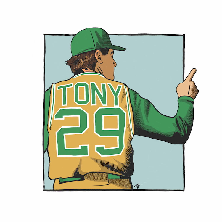
Anthony La Russa graphic by Todd Radom.
In 2015, Todd served as co-curator of “The Sports Show” at the SVA Chelsea Gallery, a sports-themed gallery exhibition of more than 140 works from 32 different artists, representing a range of creative disciplines. Radom currently serves as chairman of the board of the SVA Alumni Society and also volunteers for the Baseball Assistance Team, an organization dedicated to assisting members of the professional baseball community who are in need.
Winning Ugly is available now via Sports Publishing.