The series of fires that ravaged California's Sonoma County and other parts of the state's greater Bay Area earlier this month destroyed over 7,000 structures and burned hundreds of thousands of acres. As evacuation orders are lifted and residents begin to assess the devastation, locals like Mikayla Butchart (MFA 2016 Illustration as Visual Essay, 2012 SVA Summer Residency in illustration) know that the real work of healing and recovery has only just gotten under way.
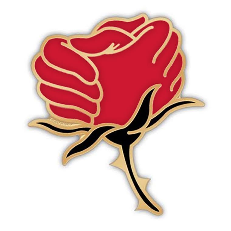
Butchart's hometown of Santa Rosa, the county seat and largest city in the region, was particularly hard hit by the Tubbs Fire, the most destructive fire in state history. "This was a disaster that rocked a city to its roots," she says. The immediacy of the fire and its after-effects as well as the solidarity shown among community members inspired her to create and sell the Rose Resilience pin, an enamel lapel pin featuring a pair of clasped hands doubling as a rose flower, with all proceeds donated directly to local relief efforts. As people look for a way to contribute to relief efforts and show their support, the pin's popularity has taken off. Thus far, sales have generated $20,000 for the City of Santa Rosa’s official relief fund, the Redwood Credit Union North Bay Relief Fund and Redwood Empire Food Bank.
After demand started to overwhelm her own website’s capabilities, Butchart moved the pin, as well as T-shirts and tote bags bearing the design to Etsy. One aspect Butchart was equipped to handle even as it happened quickly: protecting her rights to the image. "I'm glad I had the forethought to copyright it—that’s my MFA education working for me—as I was not expecting the image to go viral and spin so far out of my immediate circle," she says. "It's taken a lot of vigilance to ensure the funds the image generates are redirected to our community, and that means keeping it in house."
We recently spoke with Butchart about her work, devised out of painful loss and the promise of renewal.
Could you talk a bit about your connection with Santa Rosa, and what inspired the Rose Resilience design?
I grew up in Santa Rosa, and my whole family lives here. I had recently moved back from Brooklyn in August after graduating from MFAI in 2016 and running my illustration studio in Greenpoint for a year. If I had been in New York while watching the fires rage at home, I would have been crazy with worry. But even here at home there was a similar sense of isolation and disorientation—so many people were displaced or evacuated.
I was not evacuated, but the other four members of my immediate family were, and I was sheltering them in place at home. We were also advised to stay off the roads for emergency personnel and evacuees and out of the smoke and ash, so there was a palpable impetus to stay put and wait. Social media was such a boon in this disaster, not just for spreading information, but also to seek and offer emotional support to everyone in this community.
And, really, everyone was affected—the degree of separation from the disaster is at most one degree. Everyone knows someone who has lost a home or was evacuated, if not themselves. Relief centers were immediately overwhelmed with volunteers and donations, and the biggest call for help was financial contributions. I didn't have a lot of money to offer so I wanted to create something that would allow people like me to join forces with other people who may have only $15 or so to give and not feel like our contributions were too small or futile. There was such a desire to feel connected to our community, so I also wanted to create an image that would offer a message of hope and emotional support, something that would illustrate the unanimous compassion and empathy Northern California has displayed, and create a collective identity of solidarity and empowerment.
How did you come to this design in particular?
I wanted to focus on the rose, which is the emblem for our city of Santa Rosa. This wasn’t just a wildfire, this was a city fire. It wasn’t a grassfire like Northern California frequently suffers at the end of our long summers. Entire neighborhoods were leveled, major commercial businesses burned to the ground, two of our three hospitals were evacuated. The magnitude of a disaster touching a city our size is enormous. So I wanted to focus on Santa Rosa as not just the center of disaster, but as a center for community and recovery.
Our emblem already has the sense of regrowth inherent in it. The rose is perennial—it grows back every year—and it's also a beautiful, tenacious plant. I experimented early on with imagery of rose hips (the seed pod that's left when all the petals fall off) but immediately nixed that. I wanted to avoid anything that looked spent, and I wanted to avoid fire imagery. An early concept with a single empowered floral fist felt aesthetically strong but not quite right; what I really wanted to capture was our flourishing communal support. So that's where the image of two clasped hands resembling rose petals came in. I think our citizens are delighted that it’s a fresh take on our ubiquitous city logo, and I also hope that it speaks to resilience and regrowth beyond just our city limits.
Has your illustration work intersected with any causes like this before?
We worked on projects like this in the MFA Illustration as Visual Essay program. We were invited to submit illustrations to Moleskine and their #OneRedDay campaign to help raise awareness of the fight against AIDS. Additionally, every year [faculty member] Viktor Koen’s (MFA 1992 Illustration as Visual Essay) students create philanthropy posters for the Stavros Niarchos Foundation International Conference on Philanthropy in Greece. So I had some good academic practice with the challenge of crystallizing major issues into a powerful visual message and experimenting with giving well established icons (such as the red AIDS ribbon) a fresh spin. My own illustration work typically skews more to the narrative, but I think figuring out the story I wanted to tell in a single graphic design is definitely what led to its impact.
Did your time in the MFA Illustration as Visual Essay program have any influence on your creative thinking, or your approach to illustration as a means of communication or effecting change?
I have so many important takeaways from my graduate education, but one of my favorites, that I return to again and again, is that you don't want your images to just repeat whatever the accompanying text is saying. You want your images to take off from the edge of where language can go, and say what language can't—otherwise you're just being redundant. I've gotten so many suggestions from my community to pair this image with hashtags like #SantaRosaStrong, and I’ve been resistant to that. I feel like if you have to caption your image, your image isn't doing its job. I'm a word person (my BA is in English literature), but words are what words are for. Hashtags are a remarkable recent invention for collecting a multitude of voices on a topic into a single stream. But, you know, good images have always done that.
This conversation has been condensed and edited.
For more on Mikayla Butchart and her work, visit mikaylabutchart.com. To browse and purchase her Rose Resilience products, sales of which benefit Santa Rosa relief efforts, visit Butchart's Etsy shop.