The SVA faculty member, artist and Pentagram partner’s ‘Type Is Image’ immersive exhibition is now on view at Die Neue Sammlung—The Design Museum in Munich.

Installation view of “Type Is Image,” an exhibition of work by artist, designer and SVA faculty member Paula Scher, now on view at Die Neue Sammlung—The Design Museum in Munich.
If you would like to put renowned designer Paula Scher’s career and impact in context, look no further than a recent article’s headline: “That Great Logo? Paula Scher Probably Designed It.” For four decades, Scher has helped lead her discipline, creating iconic identity work for Citibank, Shake Shack, the Public Theater and many other institutions. In 1991, she became the first-ever female principal at the famed Pentagram design studio, and she is a longtime BFA Design faculty member at the School of Visual Arts.
Last month, a retrospective of Scher’s work, “Type Is Image,” opened at Die Neue Sammlung—The Design Museum in Munich. The show is an immersive installation and the first exhibition in the museum’s two-story high, 3,700-square-foot central gallery dedicated to the work of a graphic designer.
MPS Branding Chair Debbie Millman, host of the long-running podcast Design Matters, recently spoke with Scher about “Type Is Image” for her Print. Below is an excerpt from their conversation, and a link to the full Q+A.
Given the distance between where you live in New York and the museum in Germany, and how did you go about creating the narrative arc or the journey through the show?
I went to visit the museum on one of my European trips. It is phenomenally beautiful, but the space for my proposed show was bizarre. The ceiling height was about 30 feet, making the space seem smaller than it was. On one side, the ceiling dropped to 12 feet, which looked very low in comparison to the rest of the space. There are giant dumbwaiters in the space where the ceiling is high, and they move up and down very slowly. There is a curved wall cutting into the rectangular space and a curved staircase behind it.
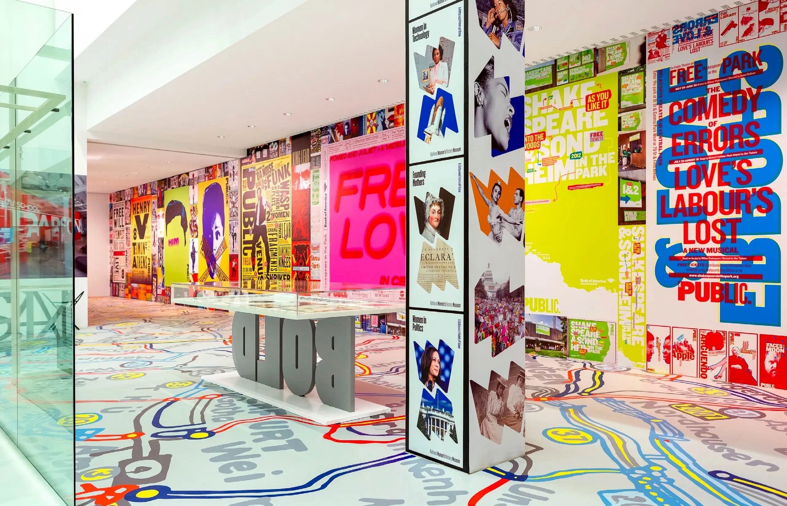
It was at that point that I realized the posters didn’t have to be the size they were; they could be printed out digitally, and we could create a Public Theater wall that would be totally filled with large season posters and then be surrounded by many other posters reproduced at smaller sizes. There would be no white space. The wall would be totally filled and continue around the corner, very much like how posters are wheat-pasted on walls in New York City.
The museum highlights your belief that “words have meaning, and type has spirit”— that people recognize type and understand the emotion, wit, power and beauty behind it without reading. What spirit do you hope museumgoers will experience being immersed in “Type Is Image”?
I think this is a joyful exhibit. Some of it is a demonstration of the breadth of my work, some of it is about the power and beauty of typography as both a communication tool and abstract form, and most of it is really about how an exhibit design creates a special environment that enables the viewer to discover what the meaning of it for themselves. We worked on the exhibit for nine months and it was one of the happiest working experiences of my career. So much of the joy was in working with Angelika and Caroline, who were so insightful and supportive, and special thanks to David Benedek, who introduced us.

Installation view of “Type Is Image,” an exhibition of work by artist, designer and SVA faculty member Paula Scher, now on view at Die Neue Sammlung—The Design Museum in Munich.
“Type Is Image” was designed specially for Die Neue Sammlung in Munich and will be on view through September 22, 2024. For more information on the museum and the exhibition, click here; for information on a companion book, also titled Type Is Image, click here.
To read Millman’s full Print interview with Scher and see more images from the show, click here.
Installation view of “Type Is Image,” an exhibition of work by artist, designer and SVA faculty member Paula Scher, now on view at Die Neue Sammlung—The Design Museum in Munich.