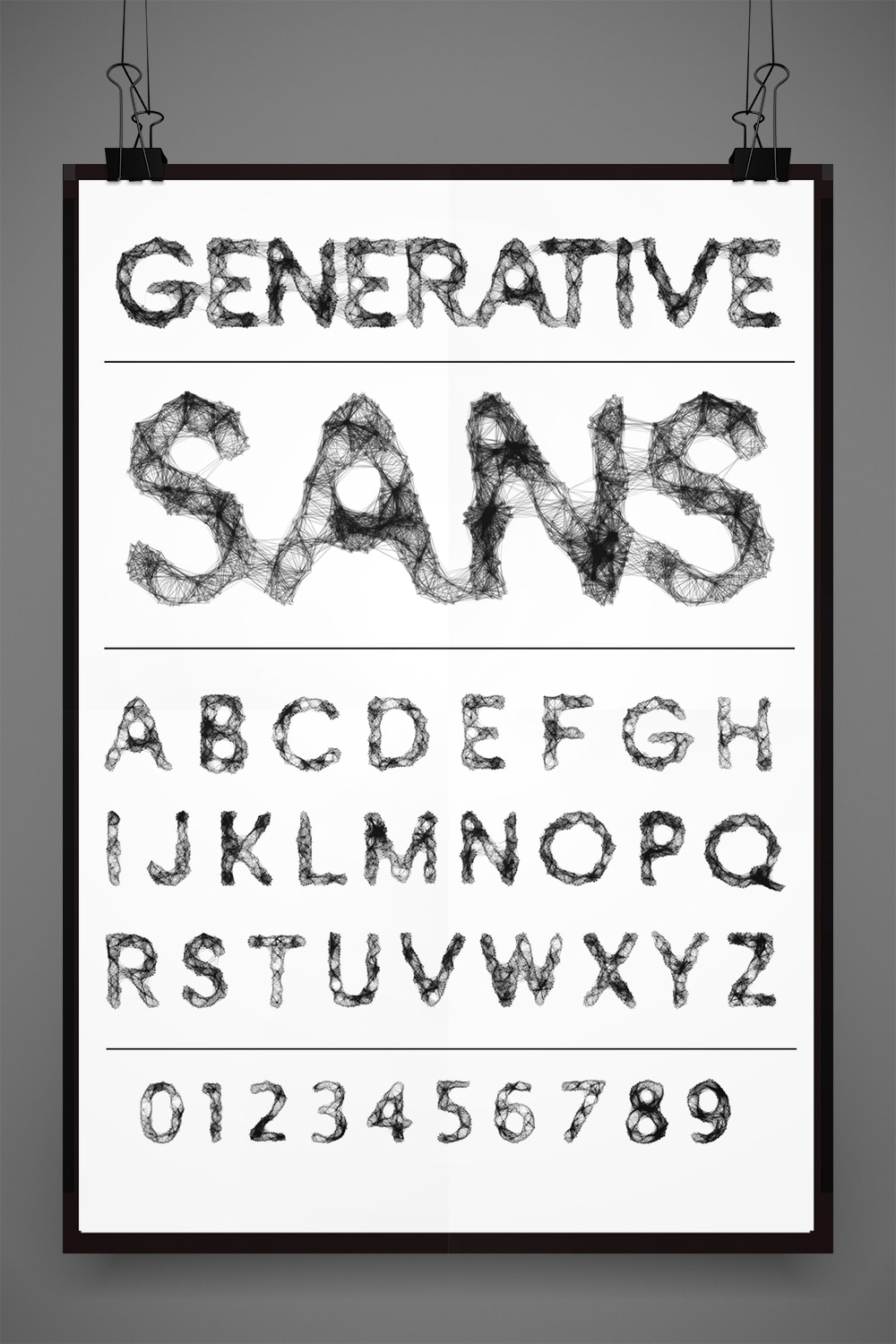
A character set for Generative Sans developed by Leon Butler.
Perhaps more than any other area of design, the advancement of typography has been tied to the available technology: the physicality of punchcutting replaced by the ephemeral vector outlines of digital typefaces, the demands and possibilities of the printed page exceeded by those of the screen. Over the last decades, designers have been experimenting with the creation of what have been called “generative” typefaces, created mainly through coding and algorithms. Generative fonts redraw and can even randomize their letterforms during the typesetting process, adding elements of uncertainty, chaos and surprise to the traditionally precise, specific discipline of type design.
The idea of a self-adjusting typeface is not new. During the 1980s, when all forms of digital type were in their infancy, Dutch designers Just van Rossum and Erik van Blokland introduced a font called FF Beowolf. To create it, Rossum and van Blokland altered the standard programming in a PostScript outline font, the technology of which allows for scaling up or down of the letterforms, to allow a degree of unpredictable randomness that occurred after the type was set. “Beowulf changed as it went from the computer to the printer each time,” says graphic designer and typographer Dan Rhatigan, “so the look of the character shapes could never be duplicated. The process was based on a now-obsolete version of PostScript, though, so it was very particular to its time and technology.”
As printer drivers and operating systems became more advanced and learned to ignore non-standard data, designers interested in creating generative type began developing the necessary programming to get the job done. Advances in OpenType, the scalable file format developed jointly by Adobe and Microsoft (and the current industry-standard technology), made many more options possible, including allowing a typeface’s programming to randomly cycle through a series of up to 10 glyphs, or symbols, for each letterform. While not truly generative, in that the letterforms themselves are not being redrawn each time they appear, this approach makes possible multiple variations within a block of text set in the same typeface.
In 2005, type designer Christian Schwartz revived a typeface he had first drawn when he was still in school, which was inspired by the jumble of mismatched and moveable letters on the sign for a Pittsburgh hamburger joint. Schwartz called his creation Local Gothic, giving each letterform a different character width and stroke weight; when randomized via a program by fellow designer Tal Leming, the typeface became odder still. “Local Gothic is a pile of alternates for every letter that you can cycle through,” says Tobias Frere-Jones, principal of Frere-Jones Type and one of the most prolific and prominent type designers working today. “The effect is like a movie theater marquee where they’ve lost some of the letters and they have to use a ‘3’ backwards to make an ‘E.’ Christian made use of a vernacular of things being repurposed on the fly.”
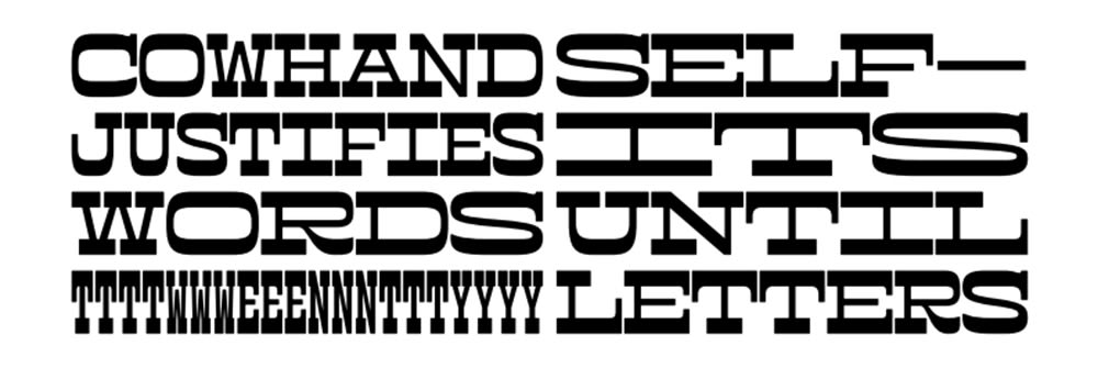
Cowhand, a typeface by Toshi Omagari.
In 1993, Frere-Jones himself designed something similar for British designer and art director Neville Brody’s experimental publication Fuse: a face called Reactor, which essentially destroyed itself as it was put to use. Inspired by a burning building and its ruins, Reactor features what appear to be random blots of gunk that show up and accumulate as more text is entered. More recently, Toshi Omagari created Cowhand, a display typeface, meant to be used for headlines and at larger sizes. All words typed in Cowhand are of equal width, whether they contain one character or 20 (the maximum the font allows).
During the time he spent at SVA’s four-week, summer Type as Language residency last year, Leon Butler, principal of Bold Visual Narrative studio in Galway, Ireland, developed a typeface he named Generative Sans. “I was looking at my own practice as a designer and thinking about new tools and skills I could add,” he says. “And I thought, What would be the craziest thing to do?” Butler devoted his residency to writing a code that would redraw a letterform each time it was typed, so that every character, while based on an existing foundational typeface, would be unique. Generative Sans won Butler a Type Director’s Club Award of Excellence in its 2015 Communication Design Competition.
Purpose is a nagging question when it comes to generative typefaces. Yes, using them is a cool trick—but what do they bring to a design that a designer couldn’t bring on his or her own? “Basically, generative type is similar to any other creative tools we have,” says Pentagram partner and BFA Design faculty member Natasha Jen (BFA 2003 Graphic Design), “be they analog or digital, a paintbrush or a computer. It doesn’t have any inherent value in itself. You need ideas to give it meaning. It’s a vehicle, it’s a process, it’s a means to an end, and it should be considered just one part of the tool kit.” One potential application: typefaces that alter themselves to better suit the format. “Erik van Blokland [an educator, computer programmer and typeface designer] has been doing some things lately with responsive lettering that changes depending on the view size of the screen,” Dan Rhatigan says.
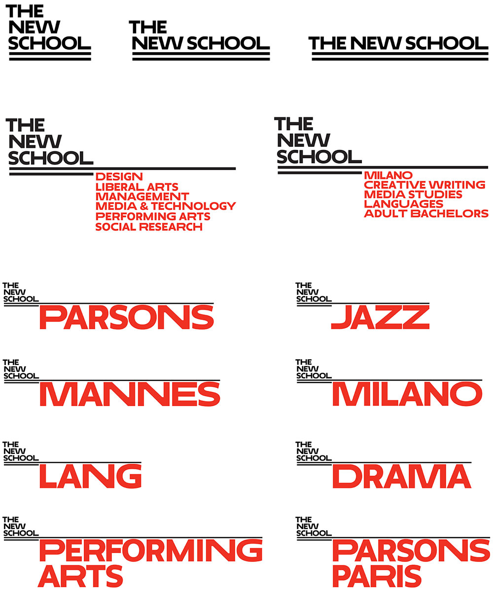
Sample text in Neue, a bespoke variable font created by Peter Bil’ak for Paula Scher's redesign of The New School's visual identity.
“We’ve entered into a period of ultimate typography,” says Paula Scher, a principal at Pentagram partner and, like Jen, a BFA Design faculty member. “People understand and can differentiate form for the first time as we’re moving from a verbal culture to a super-sophisticated visual one. I find I have to redraw or customize everything for my client’s ‘ownership’ of it. It’s changed the way we think about typography.” In her recent redesign of the visual identity for The New School, a private university in New York City, Scher’s objective was to create something that would be reflective of the university’s stated commitment to innovation, academic freedom and experimentation, and adaptable enough to evolve over time. One element of the identity is Neue, a bespoke variable font she commissioned from type designer Peter Bil’ak. Neue’s letterforms, based on Bil’ak’s font Irma, are governed by a custom algorithm that alternates regular, extended and very extended widths of the same font within a block of type.
“A lot of this generative stuff is not type—it’s illustration,” says typographic artist and graphic designer Yomar Augusto. “The final result is an illustration piece, creating visual content from typographic elements. . . . It’s beautiful, but it’s not straight typography anymore. There’s so much more you can do if you base it on actual content, say, the data of your bank account. What if the location and movement of your body could generate typography? The beginning and end of the code are question marks. The data can keep changing, forever different, and that’s amazing.”
The future will likely bring more typefaces with generative, responsive and reactive qualities driven by clear and practical intent, though at the moment, most of what’s happening is theme and variation, such as designer Ellmer Stefan’s Pyte Foundry project. Every Monday in 2016, Stefan has introduced a new digital font, each based on the same underlying “skeleton” font but made unique through alterations to the individual letters’ parts, such as their stems or serifs. The resulting character sets, available for free download, show a surprising variety of forms and textures.
Perhaps the best way of thinking about generative type is as a kit of parts that allows designers to quickly create alternatives and versions while retaining control over the results, even as more vexing questions remain. What is the type reacting to as it generates itself? Is it something external, like the content or the format of the page? Or is it just reacting to itself? And what is the role of the human designer in all of this? Does generative type represent a loss of control and creativity, like a set of premixed colors that don’t reflect individual design choices and preferences? These issues will give type designers plenty to think about in the years ahead.
Angela Riechers (MFA 2010 Design Criticism) is an art director and writer and the coordinator of Typography as Language: Theory and Practice, an SVA Summer Residency Program.
A version of this article appears in the fall 2016 issue of the Visual Arts Journal.