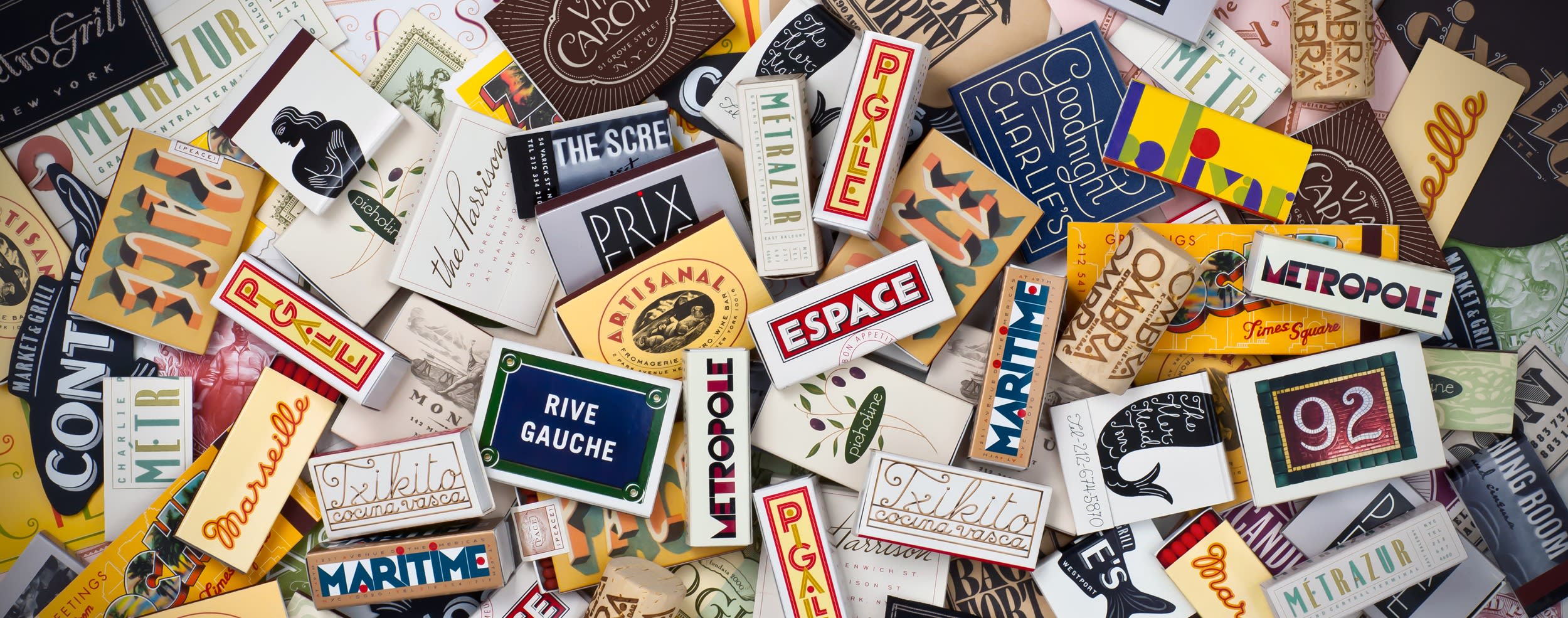
Various match packages designed by graphic designer and BFA Design faculty member Louise Fili.
Few artists have brought as much visual delight to our everyday lives as much as graphic designer, typographer and longtime BFA Design faculty member Louise Fili. Scan your cupboards, your bookshelves, the postage stamps on cherished letters, or that bowl of restaurant matchbooks you’ve been collecting, and chances are you have a Fili original in your midst. The illustrious designer was recently bestowed the Frederic W. Goudy “Excellence in Typography” award by the Rochester Institute of Technology. Fili is only the fifth woman to receive the accolade in its 52-year history.
Named after the American printer and type designer, the prestigious honor has been awarded to “an outstanding practitioner in the field of typography” annually since 1969. Past recipients include titans of type designs like Hermann Zapf, Matthew Carter, and Adrian Frutiger. Female awardees are Gudrun Zapf von Hesse, Edna Bielenson, Kris Holmes and Claire von Vliet. “For a designer to be mentioned in the same sentence with Frederic W. Goudy is an honor in itself,” Fili said during an April 30 ceremony, held virtually due to ongoing COVID-19 concerns. “How could I have known when I was four years old and surreptitiously carving letterforms into the wall above my bed at night that this could lead to a career in typography?”
True to her trademark acuity for detail, Fili noted the significance of her award’s design. “The certificate was typeset using Goudy’s border designs and Bertham typeface, which was named after his life partner, Bertha and is considered to be his 100th type design,” she noted.
In the hour-long lecture via Zoom, Fili gave a dazzling overview of a multi-faceted career as a graphic designer, business owner, typography archivist, longtime College faculty member and recipient of the 28th annual Masters Series Award and Exhibition. Though Fili had only formally released her first typeface five years ago—Mardell, a display font created with The Hamilton Wood Type & Printing Museum—she has devoted a lifetime to drawing, perfecting, and collecting letterforms. The obsession began on her first trip to Italy at age 16 when she was instantly charmed by the beautiful pasticceria papers and charming bits of graphic ephemera. Fili then taught herself calligraphy and trained her skills by making “illuminated manuscripts” of Bob Dylan’s lyrics for her schoolmates. (Fili has also designed two other typefaces: the French Art Deco-inspired Marseille and Montecatini, a font that evokes the romance of vintage Italian travel posters.)
Eschewing the efficiency of computers, Fili has always championed a hands-on approach. “When I would design a cover, I did everything I could to avoid using standard typefaces,” she explained. “Instead, I would take a tracing pad and take the title of the book and write it over and over, page after page after page, letting the words speak to me and fill the rectangle. It would go from a jumble of letters to something more precise, which was a letterform that didn’t exist, so I would have to figure out how to create it. This is how I learned to design logotype,” she said.
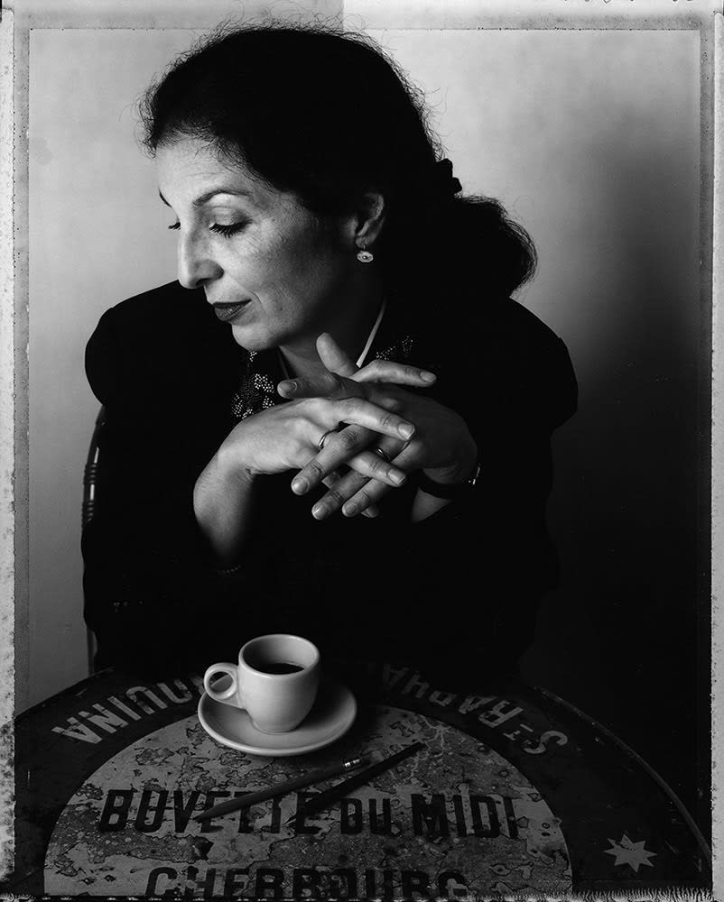
Graphic designer and BFA Design faculty member Louise Fili.
Vernacular typography remains a fount of wonder for Fili. In large and small gestures, she has not only improved food packaging, book jackets and restaurant graphics, but she’s taught us to open our eyes to humble masterpieces of design in our surroundings. During annual trips to Europe, Fili chased hand-lettered signage before big chains brought down their businesses. Operating much like an archeologist, she would research and plot routes via Google Street View before a trip. Armed with a telescoping pole (not a selfie stick, she clarifies), Fili would become well-known for her dogged pursuit that the European newspapers began to notice. The Italian press would write, “We walk by these signs every day and it took an American to make us appreciate them.” Fili’s type expeditions have also been the basis for a winning series of books co-written with husband Steven Heller, also a longtime College faculty member and co-chair of the MFA Design department.
Fili opened her own design studio in 1989, the year her son Nicolas was born. Design makeovers, she explained, became her metier. “I love makeovers because it gives me enormous satisfaction to clean up after someone else’s mess,” she noted. “It has taught me two lessons: One, a good package design can make a product taste better. And two, a bad name can seem less bad when it has a good logo.”
A consistent feminist voice in the design industry, many independent designers and entrepreneurs who encounter some form of misogyny in their careers, look to Fili’s example. Using her name on her business’s marquee is a subtle but firm message for anyone seeking her services. “I just wanted to send a clear message: If you have a problem with my being female, then I have a problem with you as my client. End of story.”
“All during this time, I was passionate about graphic design and desperate to find female role models. There were none,” said Fili. “Since that time, I’ve made it my mission to mentor as many female designers as I can to ensure that in my lifetime, I’ll see a greater representation of women receiving awards as prestigious as this one.”
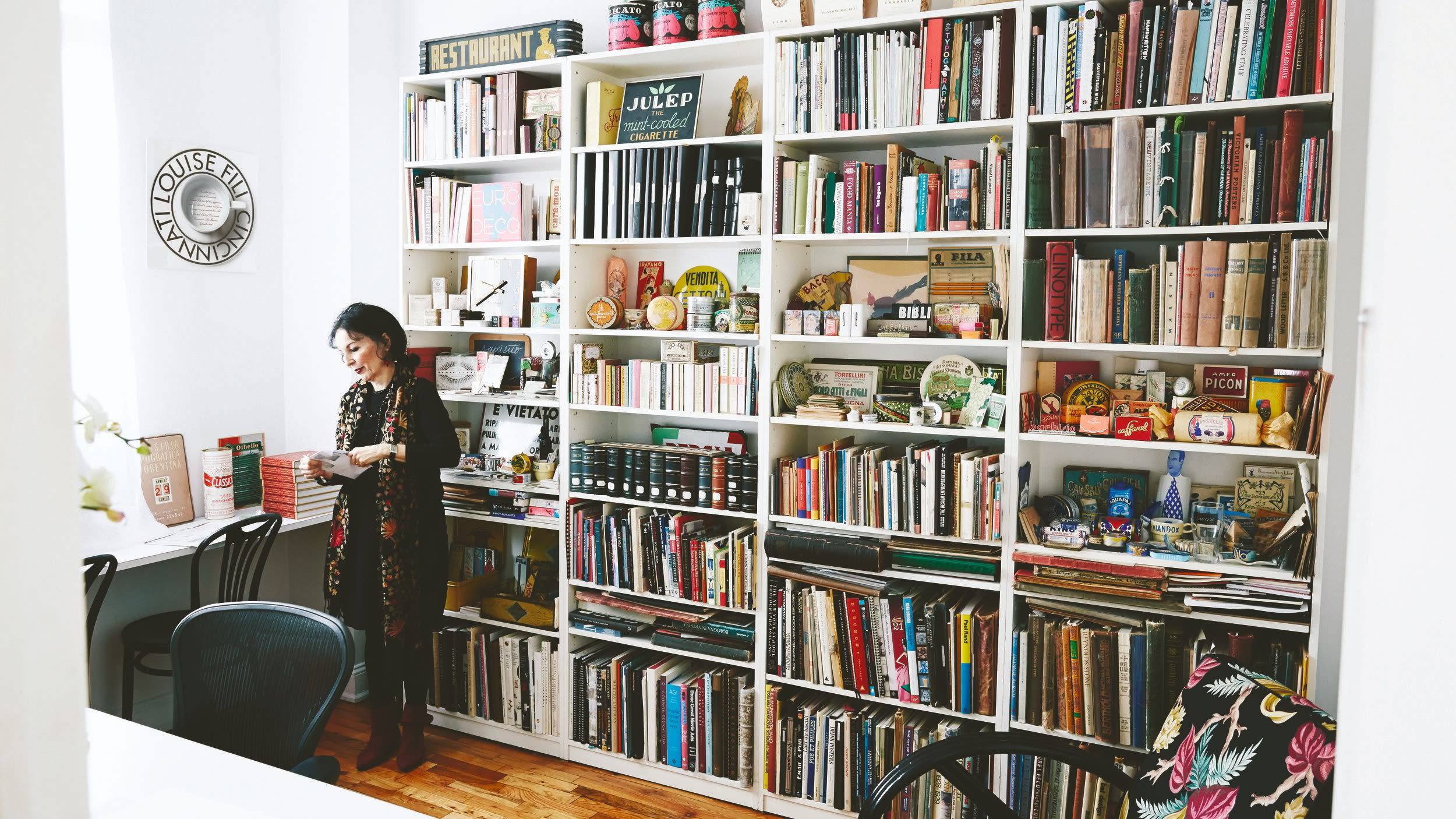
Louise Fili in her home studio.